
Guide
Creating accessible documents
This guide offers practical help so you can make inclusive Word documents and PDFs that are easy to read and understand by your entire audience.
Updated on 26 February 2026
This guide has been created to help you quickly assess and improve the accessibility of your documents.
We recommend that you complete Microsoft's Accessibility Fundaments course. It gives a more in-depth look at the challenges of creating accessible documents. It also offers badged accreditation.
Higher Education is more diverse than it has ever been. We know that different groups of students have different rates of completion and attainment. And we know that one in six of our staff and other members of our audiences, including the general public, have a disability or impairment.
By ensuring our documents are fully accessible, we can reach more of our audience and give them the best possible experience. When producing documents of any kind, we need to ensure that, by law, we do not disadvantage or exclude anyone.
Ensuring our documents can be read and understood by everyone, including people with disabilities or impairments, is a legal requirement under the Equality Act 2010.
Think about your format
Publish in HTML format wherever possible so that your documents use your users’ custom browser settings. Some people find other formats difficult to use. For example, PDF documents:
- can make your content harder to find, use and update
- do not work well with assistive technologies like screen readers
Document accessibility fundamentals
Here is an at-a-glance guide to document accessibility for those needing a quick overview of how to make a document fully accessible:
- Provide a descriptive title for your document
- Add your title, name, and language in File > Properties
- Use the built-in styles in Word for each bit of content, especially headings
- Ensure headings are in the correct order and don't skip levels
- Use dark colours against a white background
- Avoid placing text on coloured backgrounds
- Ensure your Word document is accessible before converting to PDF
- To fix PDF issues in Adobe Acrobat, you need to fix the source document in Microsoft Word
- Some PDF issues reported by Adobe Acrobat, such as untagged annotations, require more time and knowledge than others but are always fixable
You must have access to the original source document (usually Microsoft Word) to address all accessibility issues within a PDF document successfully. While colour contrast and image alt text are important, document accessibility is mainly about creating clear and concise content, and this is done in the original document.
Microsoft Word accessibility
Layout and design
Begin with a simple, uncluttered layout for your document. Avoid common accessibility issues by avoiding the following mistakes:
- placing text on coloured backgrounds
- using tables for layout
- replicating layouts from the web or professionally designed brochures
Fonts
Choose either Baxter Sans or Calibri for your document as these have been tested for readability and accessibility. Adhere to the minimum font sizes below:
- Baxter Sans: 10px
- Calibri: 12px
Title
Provide a descriptive title that informs your reader what the document is about. Use the Heading 1 style from the Home menu at the top of Microsoft Word or select it from the Styles Pane.
Headings
Break up blocks of text into sections using the headings from the styles built into Microsoft Word. This will help you avoid overwhelming your audience, especially those with cognitive impairments.
A good heading structure also drastically improves the experience of people who rely on a screen reader or other assistive technology as they will scan through the headings to quickly get an idea of the entire document's contents.
Headings are also used to create Bookmarks in Adobe Acrobat, making PDFs easier to navigate for everyone.
Paragraphs
Use short sentences and around two or three sentences per paragraph. Each paragraph should cover a single idea or concept.
Lists
You can make your content easier to read by summarising key points in a list instead of using multiple paragraphs. Lists are easy to scan and improve everyone's understanding and overall experience.
Images
Each image you use will need alt text to describe the contents for members of your audience who cannot see it. You can leave the alt text blank if your image is purely decorative.
Microsoft Word may generate alt text for you. Typically, automatically-generated alt text isn't very accurate, so you will need to write your own alt text or remove it entirely for decorative images.
Read the guide for writing descriptive alt text.
Colour
Use colour carefully, and be aware that not all of your audience can see every colour, so your intended meaning will be lost for some.
Colour blindness (colour vision deficiency, or CVD) affects approximately 1 in 12 men (8%) and 1 in 200 women. In the UK, there are approximately three million colour-blind people (about 4.5% of the entire population).
Links
Avoid linking to text like 'Click here' or 'Read more' when creating links in your document. Instead, add your link to text that helps your audience understand where the link will take them, for example, the name of a website or web page.
Your link may be read aloud by assistive technology tools – some screen reader users may just choose to listen to a list of headings and links from your document. You should keep your link text unique and avoid any repetition for this reason.
Read the guide for writing useful and accessible link text for websites.
Tables
Tables are appropriate for presenting data in two dimensions but should not be used to present content. This can create problems for some disabled people when trying to understand your content.
Provide a title and summary above your table, especially if the data it presents is complex. Split large tables into smaller, simpler sets of tables, if possible. This will ensure people with cognitive impairments and other members of your audience can understand your document.
To further aid understanding, ensure the headers in your table are styled differently from the content in data cells.
Table of contents
Longer documents should always use a table of contents. This makes navigating the Word and PDF documents easier for everyone and gives your audience an immediate understanding of the structure and contents of your document on a single page.
Document properties
Before distributing or converting your document, edit the Properties of your document using the File menu to add the following information:
- Title (found under Summary)
- Author (found under Summary)
- Language (found under Custom by searching for 'Language')
This information will be used by assistive technology tools like screen readers. Any PDF documents that are missing this information will fail accessibility checks.
Testing your Microsoft Word document
Using the built-in Accessibility checker
Microsoft Word includes a built-in accessibility checker. This can be activated using the Check Accessibility option under Tools. These automated checks will scan your document for text with low levels of contrast and images missing alt text. It will also inform you if Word has generated alt text automatically. As mentioned previously, you should always review and rewrite automatically-generated alt text.
Microsoft Word can also be configured to check accessibility as you create your document (see the Accessibility options in Preferences).
Testing for readability
A document that is easy to read provides a better experience for everyone but is especially beneficial for disabled people and readers who aren't native English speakers.
You can test your document for readability using the Grammarly tools and native app or the Hemingway app. Both tools will give your content a reading score that accurately reflects the reading age required to understand your content. Aim for a reading grade below 10, equivalent to a reading age of at least 16.
Content standards
Follow the University's content style guide to ensure your content meets the appropriate standard in terms of spelling, grammar, tone, voice, and consistency.
Colour contrast checks
Low colour contrast between text in the foreground and the background colour of your document will mean some readers will have difficulties reading your content. This is especially true if bright sunlight is shining on their screen.
If you think parts of your document may have low colour contrast, you can perform a quick test using the Colour Contrast Analyser tool available for Windows and Mac. Use the tool to select the colour of the text and then the background colour. It will inform you if the contrast is too low according to the legal guidelines (WCAG 2.1).
Converting to PDF
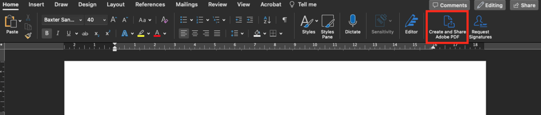
Use the Create and Share Adobe PDF option at the top right of the Home menu to convert your Microsoft Word document into PDF. This option creates high-quality, rich and accessible PDFs using Adobe Create PDF cloud service. You don't need to share your document as part of the conversion process.
Testing your PDF
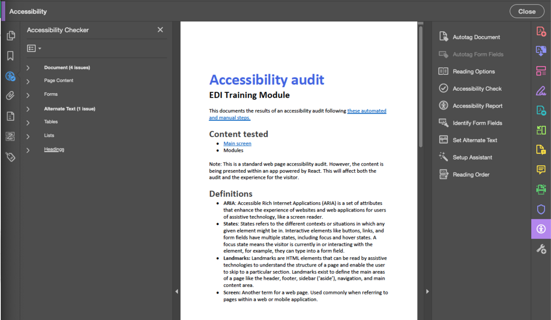
Like Microsoft Word, Adobe Acrobat Pro (available via the Self Service app) has built-in accessibility tools. Access these using the Accessibility button available in the toolbar on the right-hand side of the app.
Open the document you wish to test and use the Accessibility Check option with the default settings to start the checking process. The tool will list any errors across categories like page content, alternative text, lists, headings, etc.
Fixing accessibility issues
Most accessibility issues that the checker tool in Adobe Acrobat identifies must be fixed in the original source document, which typically means editing the Microsoft Word document used to create the PDF.
You can refer to the Microsoft Word accessibility guidance earlier in this guide to address all issues with:
- Document properties
- Alternative text
- Tables
- Lists
- Headings
Tagged content and annotations
Adobe Acrobat commonly reports issues related to tagged content and annotations. This simply means that it doesn't understand some bits of your content and would like to tag or mark these as a specific element, such as a link, paragraph, heading or something else.
Fixing these issues helps screen readers and other assistive technology to tell text apart from links, quotes, image captions, and other specific types of content.
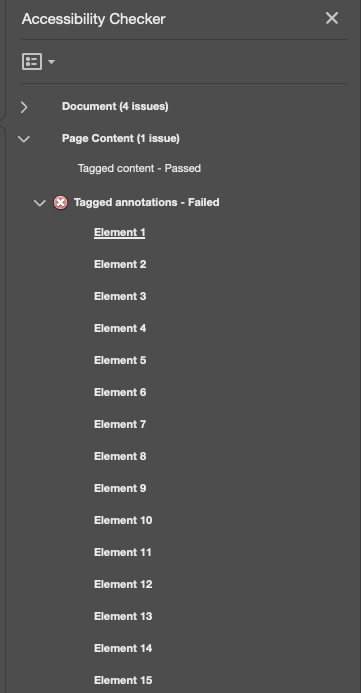
If you have a lot of untagged elements in your PDF, use the 'Autotag Document' option at the top of the Accessibility pane. This feature will automatically retag your document and should fix any issues related to tagging. However, this process can lead to some layout issues, so check through your document carefully once the process is complete, especially if the layout is complex.
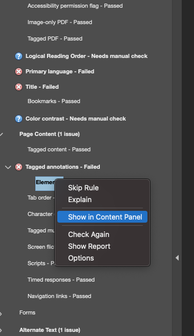
To fix tagging issues individually, follow the steps below:
- Right-click the failing tag (usually called 'Element 1' or similar)
- Click Show in Content Panel
- Right-click the annotation (typically named 'Link')
- Click Find
- Select Unmarked Links or Unmarked Annotations from the select list, depending on the type of failure
- Click Find
- Click Tag Element and select the appropriate element (e.g. Link)
- Click Okay and repeat for all failing elements
- Rerun the Accessibility Checker to confirm the issues have been fixed
Final checks
Run the Accessibility Check again in Adobe Acrobat Pro once you think you have addressed all the issues it has reported. Remember that automated testing is not enough to ensure your PDF is fully accessible. Refer to the guidance on testing earlier in this document for the manual testing steps required in addition to using built-in accessibility tools.