
Art & Design Undergraduate Degree Show 2026
Saturday 23 – Sunday 31 May

Opening times
Late openings on Thursday 28 May and Saturday 30 May, 10:00–20:00
About the show
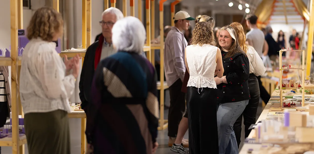
The annual Degree Show is the opportunity for all our graduating students to exhibit their work to the public, transforming our buildings for nine days into one of the largest free arts venues in the country.
Degree Show 2026 is both a celebration of the years of hard work they have invested and a springboard to launch their creative careers beyond the university’s walls.
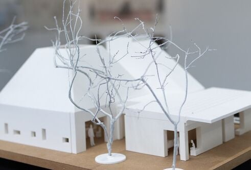
Visiting Degree Show is your chance to see the next generation of creative talent before anyone else. Take time to explore our buildings, studios and exhibition spaces and see how students have pushed themselves to experiment with new technologies, materials, processes and ideas as they continually put new-found skills into practice.
This year, 427 students have collectively produced an astonishing range of work; everything you see represents the culmination of their time at university, underpinned by creative thinking, research, development, collaboration and technical and artistic skill.
Alongside the show, the Alternative Futures Showcase celebrates the design research achievements of selected students from all eight of our undergraduate design programmes. Their diverse projects, written in a range of formats, engage with cultural, social, economic, environmental, technological, and communication challenges, relevant to our globalised society.
In addition to the dissertations in the Alternative Future showcase, you can also read this year’s Contemporary Art Practice dissertations online.
We look forward to welcoming you to Duncan of Jordanstone College of Art & Design to see the show, celebrate the achievements of our graduates and wish them all the very best for the future!
Getting here
Parking
Members of the public are not permitted to park on campus between the hours of 08:00 and 17:30 Monday to Friday.
Outwith these times, visitors can park on city campus by paying an appropriate fee via the RingGo app. Fees for non-permit holders are applicable Monday to Friday from 17:30 to 00:00 and Saturday and Sunday from 08:00 to 00:00.
For more information about parking on campus, please visit the University of Dundee Car parking page.
Alternative parking is available on the surrounding streets, and public car parks near the campus. For more information, please visit Dundee City Council Parking Charges and Locations page.
Find us
Duncan of Jordanstone College of Art & Design
University of Dundee
13 Perth Road
Dundee
DD1 4HT
Your support helps turn years of hard work and dedication into professional success.
Stories
-
- Type
- Press release
Dundee graduates selected for RSA New Contemporaries
Fourteen University of Dundee graduates are among those chosen to exhibit at Scotland’s most prestigious showcase for young creative talent.
-
- Type
- Feature
From studio to collection
University of Dundee Museums Curator Matthew Jarron reflects on the enduring legacy of the Duncan of Jordanstone College of Art & Design Degree Show
-
- Type
- Press release
More than 400 students to showcase art and design work at DJCAD’s Degree Show 2026
The Art & Design Undergraduate Degree Show 2026 takes place from 23 to 31 May, at the Duncan of Jordanstone College of Art and Design.
-
- Type
- Press release
From violence to sustainability – 5 students' inspiration for Degree Show 2026
Five art and design students share the inspiration behind their work on display at the Art and Design Undergraduate Degree Show 2026, from violence and racism to sustainability
-
- Type
- Press release
Cakes brought to life through illustration in DJCAD graduate and Fisher & Donaldson partnership
Pop-up shop for one day only at Degree Show 2026 to celebrate partnership between Duncan of Jordanstone College of Art & Design graduate and Scottish bakery Fisher & Donaldson


Accessibility
For general access enquiries, to discuss individual requirements, or if you are planning to visit in a wheelchair or with a wheelchair user, email [email protected] in advance of your visit. This inbox is monitored on weekdays.
You can also call DJCAD reception during the school’s opening hours on 01382 381222.
Visitors under 16 must be supervised by a responsible adult at all times.
There are plenty of water coolers and refill stations across both buildings.
Seating can be found across both buildings with folding chairs available on request.
Matthew Building
- View location information for the Matthew Building
- View Matthew Building accessibility information on AccessAble
Crawford Building
- View location information for the Crawford Building
- View Crawford Building accessibility information on AccessAble
Accessible parking
Parking on our campus is restricted to permit-holders or Blue Badge holders, who may park in designated accessible parking bays only.
Additional parking information can be found on the Dundee City Council website.
Stay in touch
Follow us on socials for more information (and tag us in your posts using #DJCADDegreeShow)!
Like what you see?
Considering studying at Duncan of Jordanstone College of Art & Design?
The student recruitment team will be available Monday to Friday if you want to speak to them about the application process.
To arrange this, please contact: [email protected] or speak to a member of our team during your visit.
Feedback
If you enjoyed your visit to the Degree Show, we’d love to hear from you. Equally, if you think there’s something we could improve on for next year, please let us know.
You can provide any feedback through our online form, or alternatively by emailing [email protected].